---
metadata:
- name: generator
content: Diplodoc Platform v5.63.0
alternate:
- en/quickstart
- ru/quickstart
- href: en/quickstart.md
type: text/markdown
title: Markdown version
csp:
- script-src:
- https://mc.yandex.ru
img-src:
- https://mc.yandex.ru
connect-src:
- https://mc.yandex.ru
- wss://mc.yandex.ru
child-src:
- 'blob:'
- https://mc.yandex.ru
frame-src:
- 'blob:'
- https://mc.yandex.ru
frame-ancestors:
- 'blob:'
- https://mc.yandex.ru
canonical: en/quickstart.html
title: Getting started with DataLens On-premises
description: >-
In this tutorial, you will get going with DataLens On-premises: connect to a
data source, create your first dataset, build several data visualization
charts, and put them on a dashboard.
vcsPath: en/quickstart.md
---
# Getting started with DataLens On-premises
This section outlines how you can connect to a data source, create your first [dataset](dataset/index.md), build several data visualization [charts](concepts/chart/index.md), and put them on a [dashboard](concepts/dashboard.md).
To get started with DataLens, follow [this deployment guide](./concepts/create-instance.md).
To access the service, you need to [authenticate](security/user-account.md#auth) in DataLens.
If you do not have a DataLens account, contact the administrator.
## Create a workbook {#create-workbook}
In DataLens, all objects are stored in special containers, i.e., [workbooks and collections](./workbooks-collections/index.md):
* A **workbook** stores [connections](./concepts/connection/index.md), [datasets](./dataset/index.md), [charts](./concepts/chart/index.md), and [dashboards](./concepts/dashboard.md).
* A **collection** is a container used for grouping workbooks and other collections.
To create a workbook:
1. Go to the DataLens page.
1. In the top-right corner, click **Create** → **Create workbook**.
1. Enter a name for the workbook: `Quick start`.
1. Click **Create**.
## Create a connection {#create-connection}
[Connections](./concepts/connection/index.md) contain information about data source access parameters, such as the DB host IP address and port. You can create datasets based on connections.
To create a connection:
1. In the top-right corner of the workbook, click **Create** → **Connection**.
1. Select the **ClickHouse®** connection.
1. In the window that opens, specify the connection parameters:
* Host name: `rc1a-ckg8nrosr2lim5iz.mdb.yandexcloud.net`.
* HTTP interface port: `8443` (default).
* Username: `samples_ro`.
* Password: `MsgfcjEhJk`.
1. Enable the **SQL to read** option.
1. Click **Check connection** and make sure you get a green check mark.
1. Click **Create connection**.
1. Enter the connection name: `Sample ClickHouse`.
1. Click **Create**.
Wait for the connection to be saved.
## Create a dataset {#create-dataset}
A [dataset](./dataset/index.md) describes a set of data and its structure. It is created by connecting to a data source. A dataset is used when creating the following widgets:
* [Charts](./concepts/chart/index.md): To visualize data.
* [Selectors](./dashboard/selector.md): To filter data.
To create a dataset based on the `Sample ClickHouse` connection:
1. In the top-right corner of the connection page, click **Create dataset**.
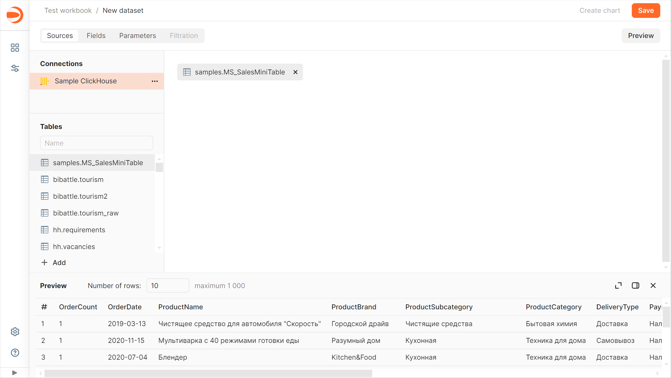
1. Drag the `MS_SalesMiniTable` table to the workspace.
1. Navigate to the **Fields** tab.
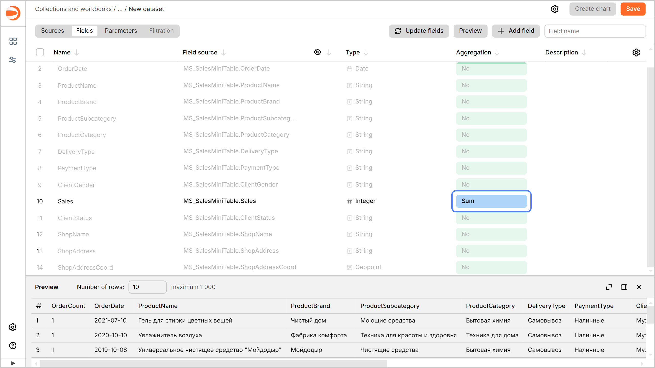
1. Create a measure for the order amount. To do this, select **Sum** for the `Sales` field in the **Aggregation** column.
1. Create a measure for the number of orders:
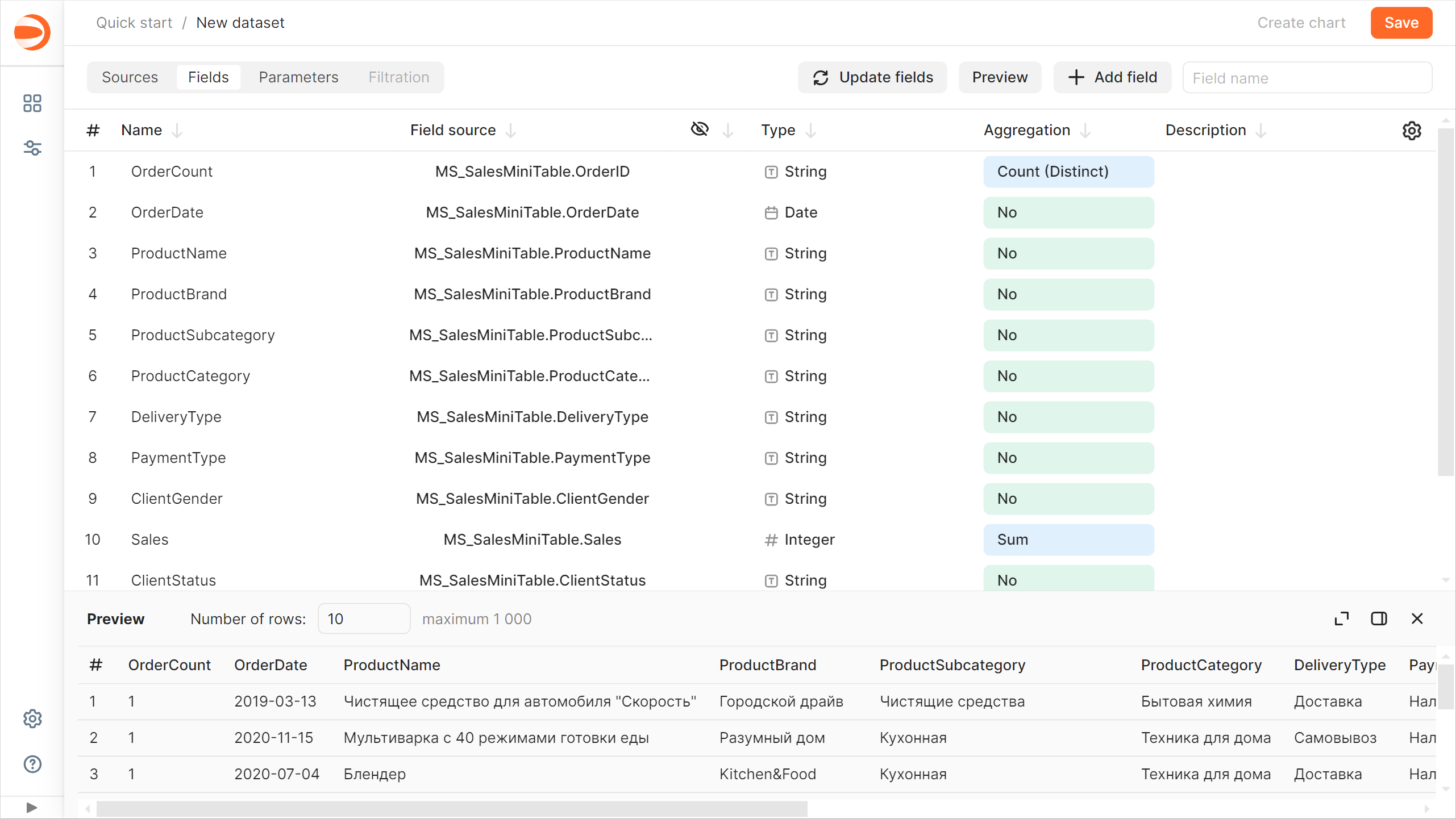
1. Rename the `OrderID` field to `OrderCount`: click the field name, delete the current name, and enter the new one.
1. Select **Number of unique** for the `OrderCount` field in the **Aggregation** column.
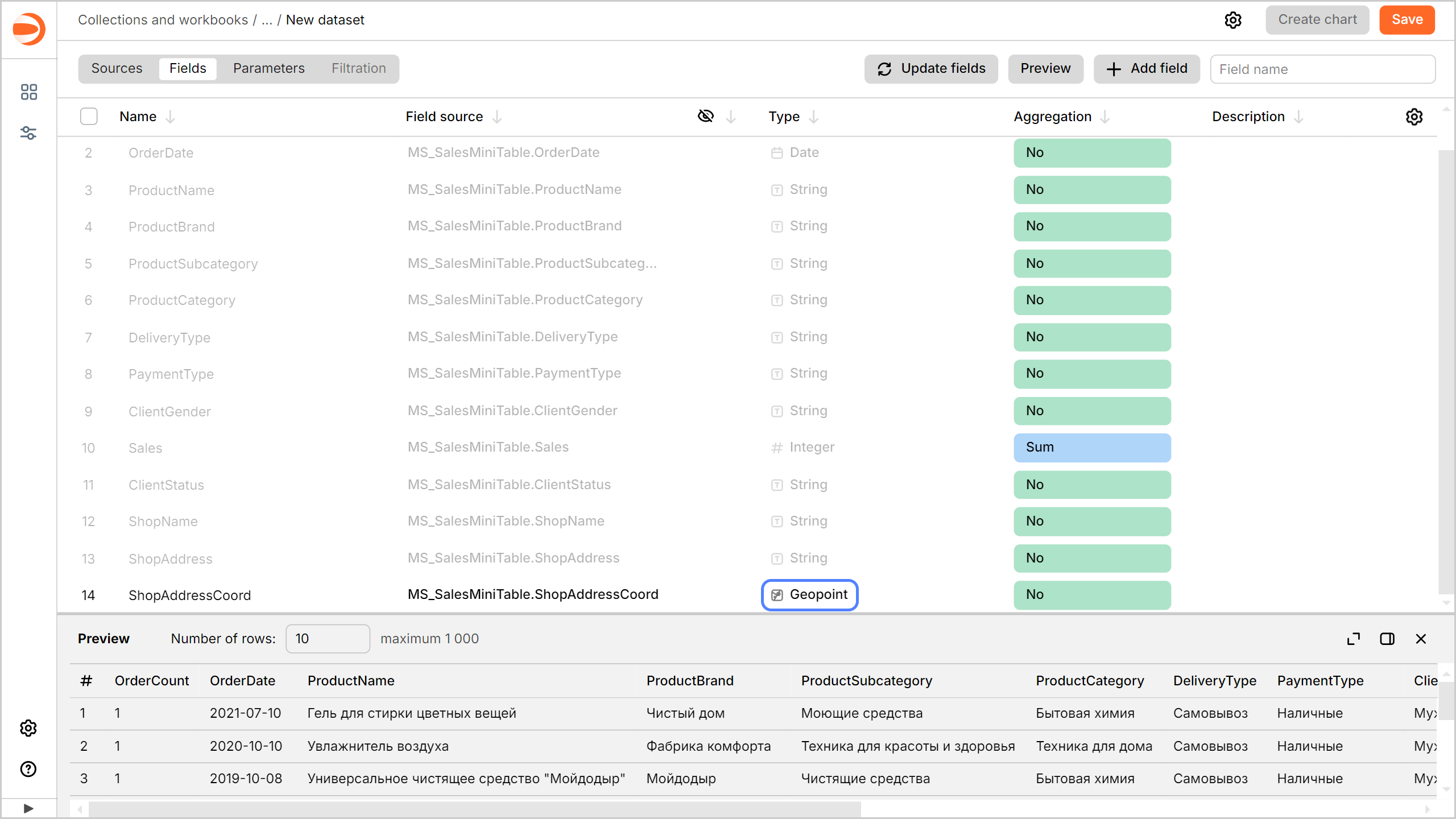
1. Change the data type for the `ShopAddressCoord` field: select **Geopoint** in the **Type** column.
1. Save the dataset:
1. In the top-right corner, click **Save**.
1. Enter `Sales Dataset` for the dataset name and click **Create**.
## Create a column chart {#create-column-chart}
A [chart](./concepts/chart/index.md) is a dataset visualization in the form of a table, diagram, or map.
To create a chart based on `Sales Dataset`:
1. Click **Create chart** in the top-right corner of the dataset page.
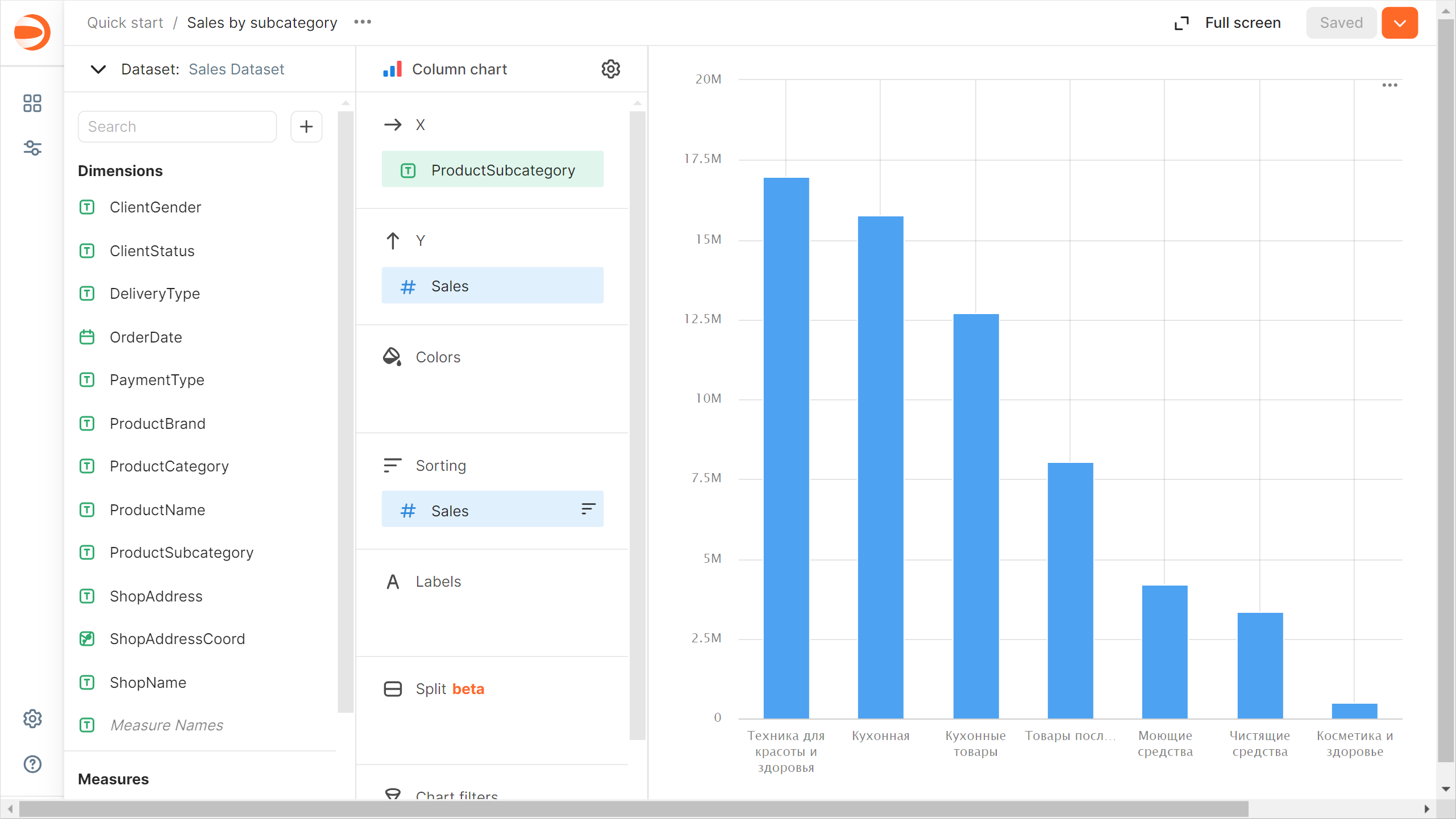
1. Add the product subcategory to the chart. To do this, drag the `ProductSubcategory` field from **Dimensions** to the **X** section.
1. Add a sales measure to the chart. To do this, drag the `Sales` field from **Measures** to the **Y** section.
1. Sort the chart by sales in descending order by dragging the `Sales` field from **Measures** to the **Sorting** section.
1. Save the chart:
1. In the top-right corner, click **Save**.
1. In the window that opens, enter the `Sales by subcategory` name for the chart and click **Save**.
## Create an area chart {#create-area-chart}
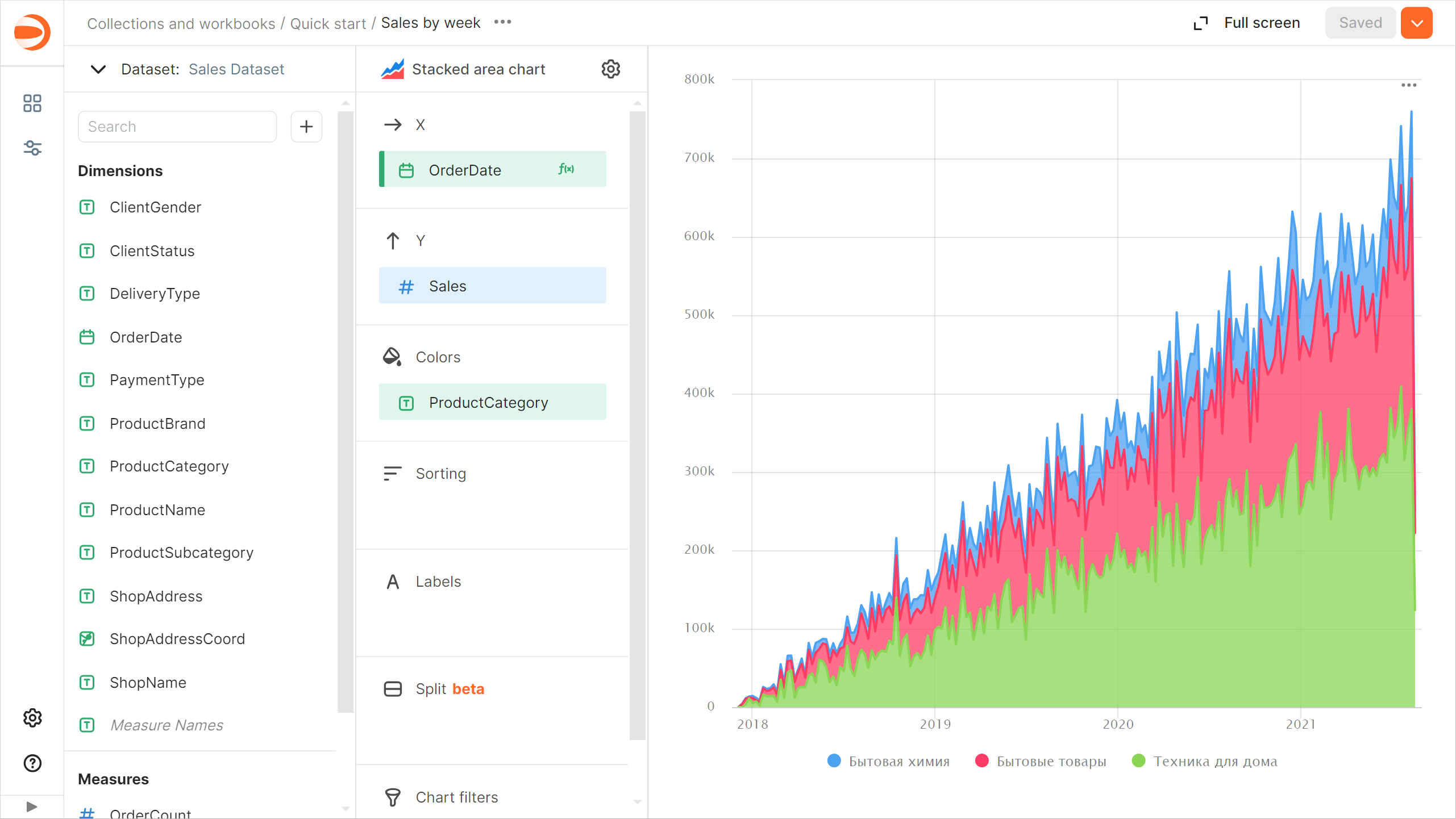
1. Copy the chart you created in the previous step:
1. In the top-right corner, click → **Save as copy**.
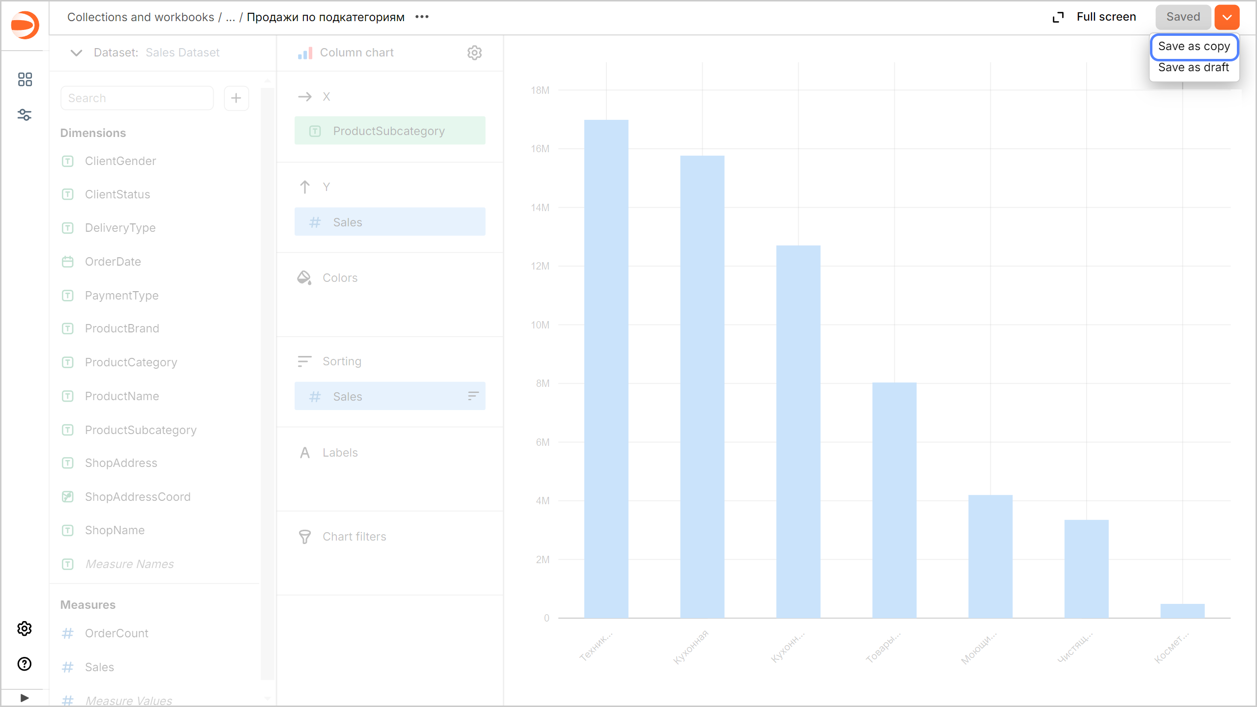
1. In the window that opens, enter the `Sales by week` name for the new chart and click **Save**.
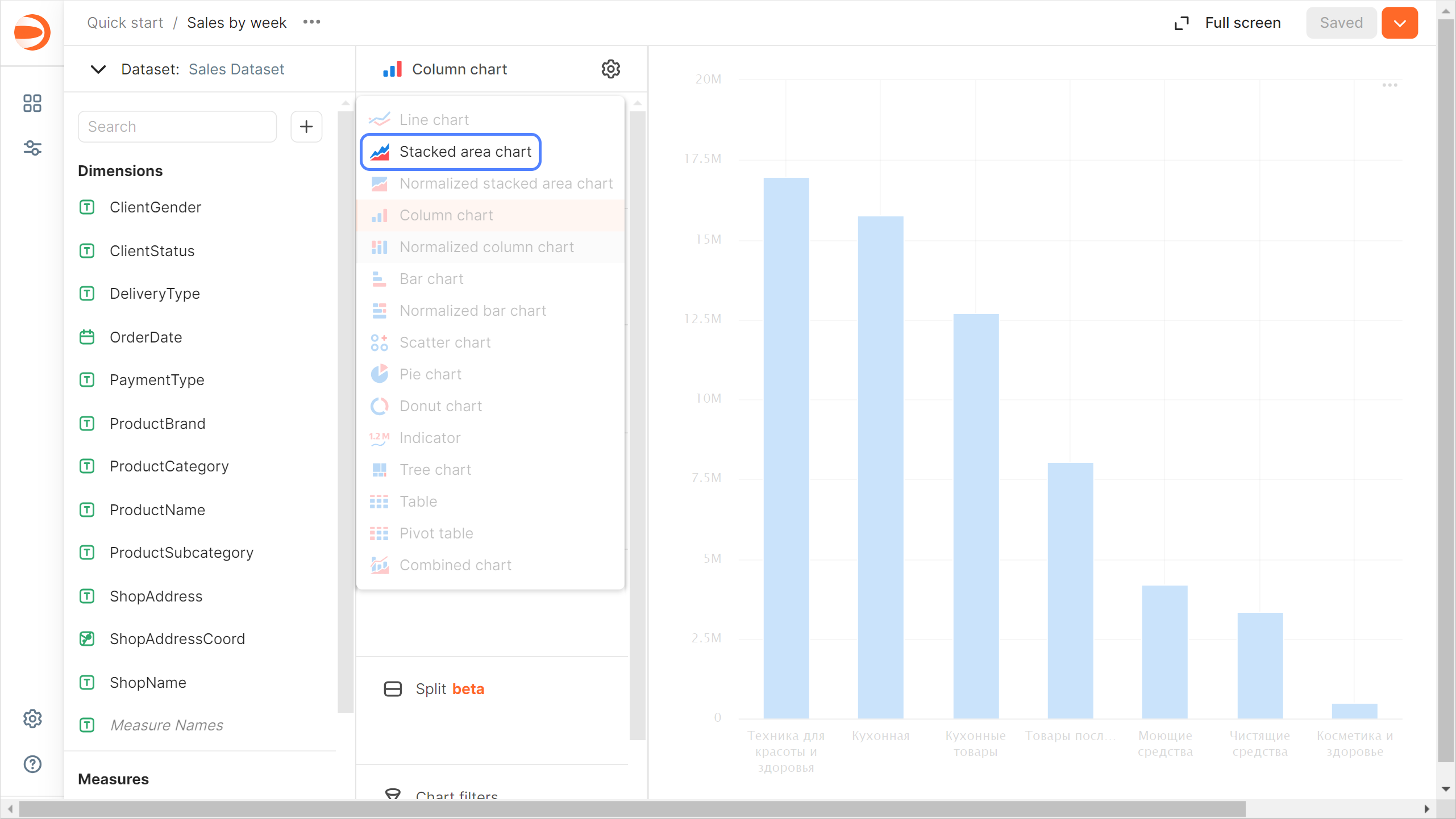
1. Select **Area chart** as the visualization type.
1. Replace the product subcategories with the order date on the X-axis. To do this, drag the `OrderDate` field from **Dimensions** to the **X** section and hold it over the `ProductSubcategory` field until the latter turns red.
1. Add the product category to the chart. To do this, drag the `ProductCategory` field from **Dimensions** to the **Colors** section.
1. Display a week by week chart:
1. Click the calendar icon next to the `OrderDate` field in the **X** section.
1. In the **Grouping** field, select **Rounding** → **Week**.
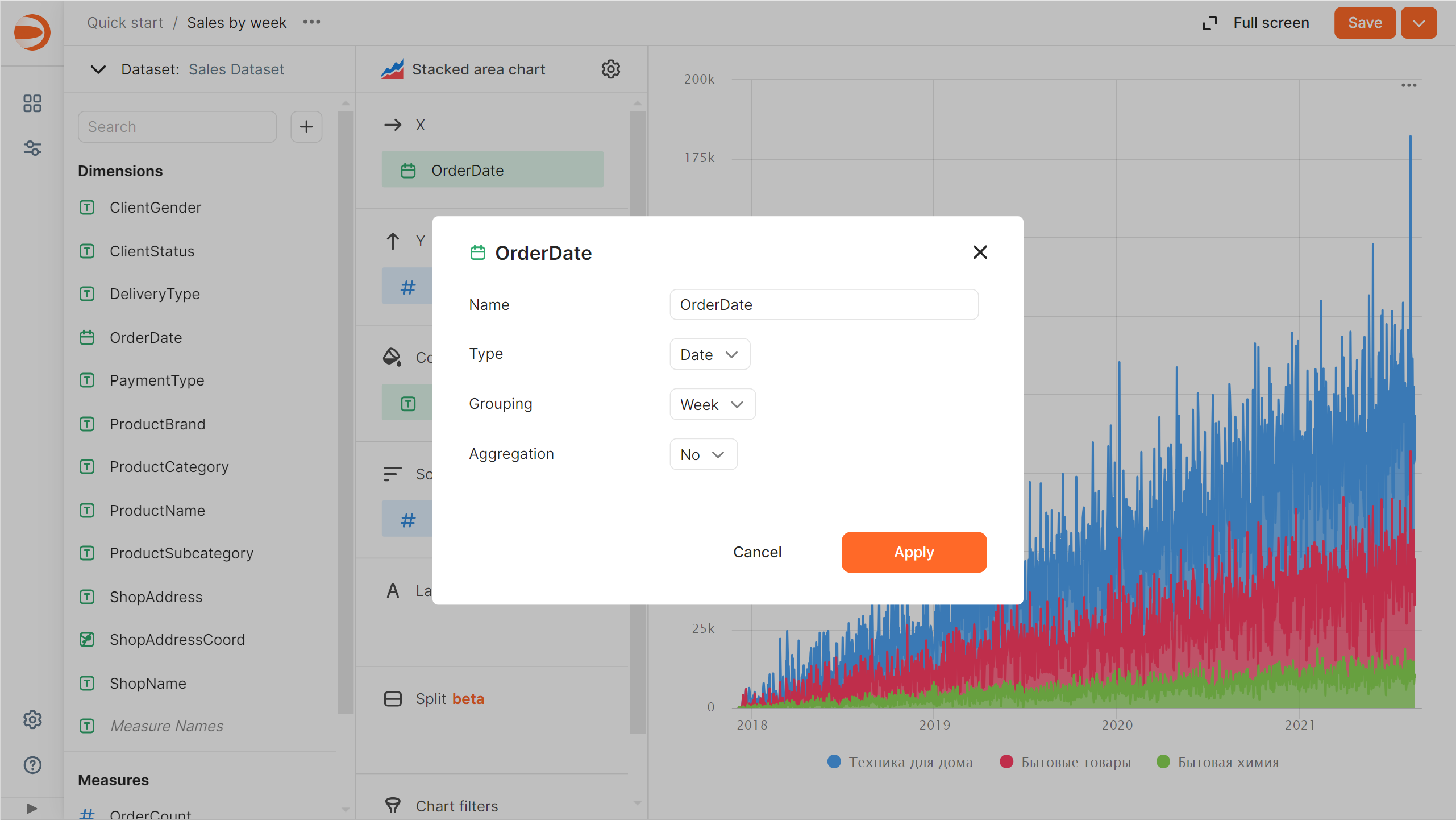
1. Click **Apply**.
1. Remove sorting by sales: click (the icon appears when you hover over the field) next to the `Sales` field in the **Sorting** section.
1. In the top-right corner, click **Save**.
## Create a pie chart {#create-pie-chart}
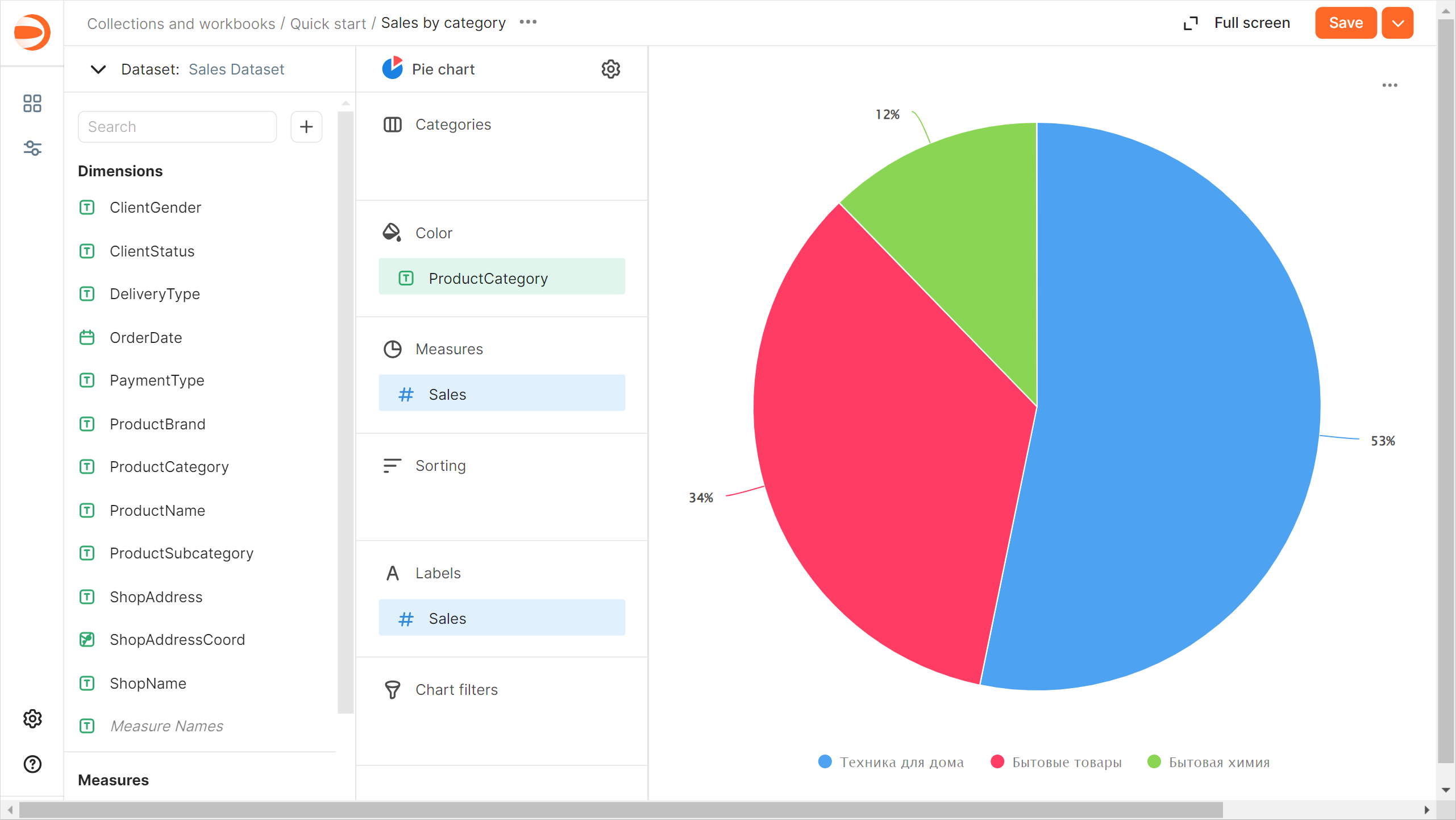
1. Copy the chart you created in the previous step:
1. In the top-right corner, click → **Save as copy**.
1. In the window that opens, enter the `Sales by category` name for the new chart and click **Save**.
1. Select **Pie chart** as the visualization type.
1. Add the product category to the chart. To do this, drag the `ProductCategory` field from **Dimensions** to the **Color** section.
1. Check that the chart includes the sales measure: the `Sales` field should be located in the **Measures** section. If it is not there, drag it from under **Measures**.
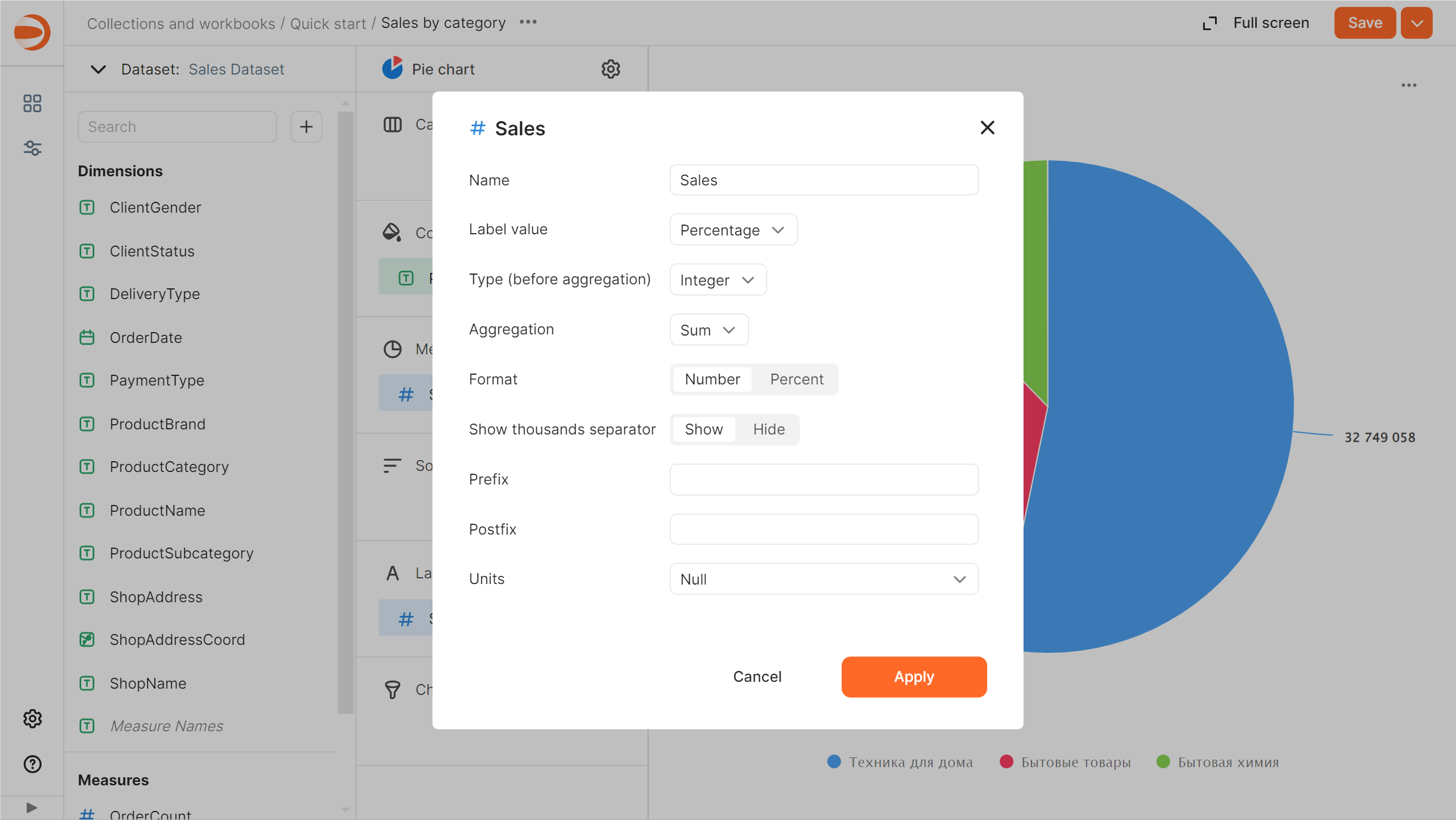
1. Add a measure label:
1. Drag the `Sales` field from **Measures** to the **Labels** section.
1. Click the icon to the left of the measure name.
1. In the window that opens, for **Label value**, select `Percentage` and click **Apply**.
1. In the top-right corner, click **Save**.
## Create a dashboard and add charts to it {#create-dashboard}
A [dashboard](./concepts/dashboard.md) is a page or multiple pages that contain widgets. It allows you to group your charts in the same place and add [captions](./dashboard/widget.md#text) and [titles](./dashboard/widget.md#title) to them.
To create a dashboard:
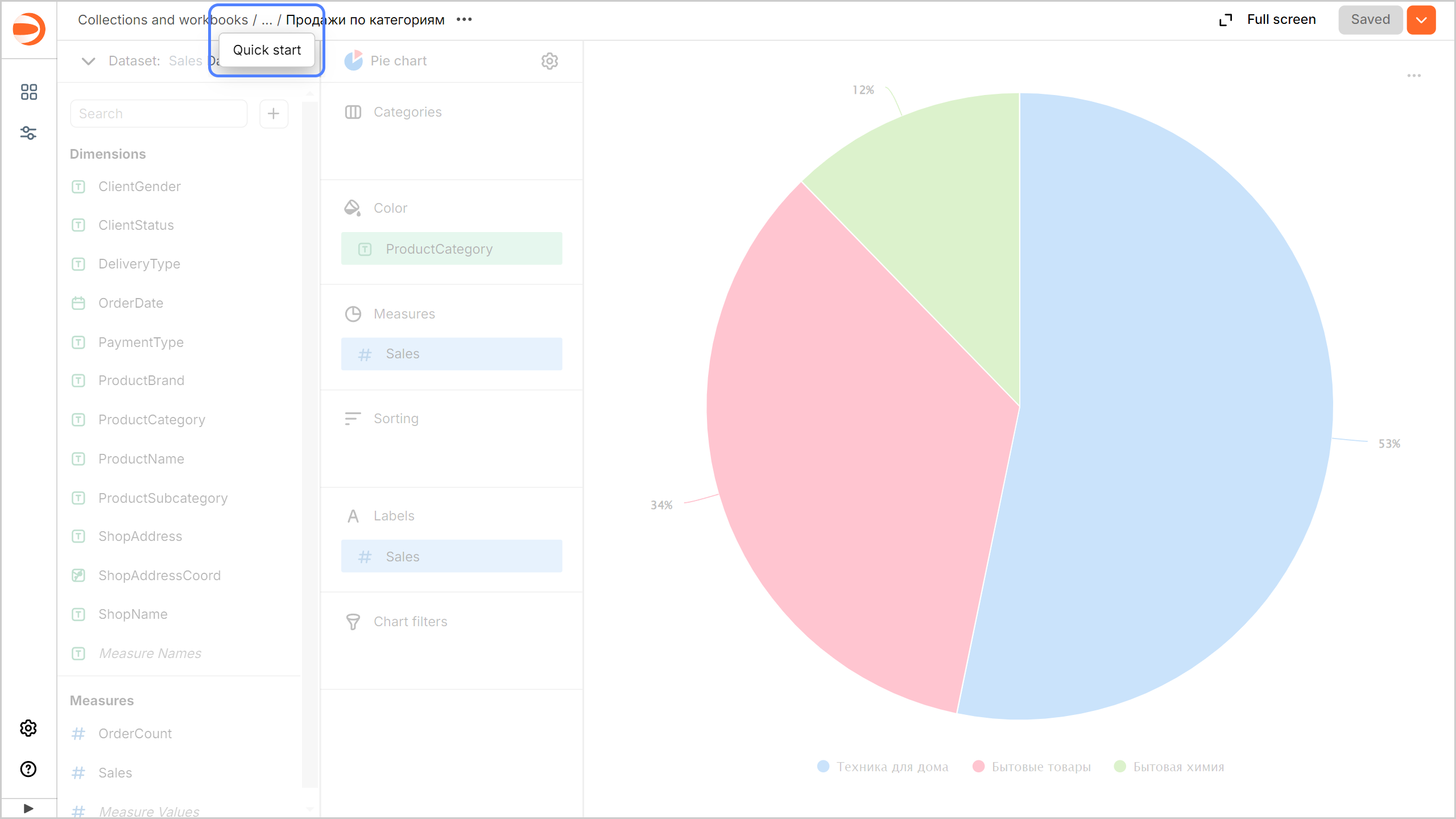
1. Go to the `Quick start` workbook by clicking its name in the chart path.
1. In the top-right corner, click **Create** → **Dashboard**.
1. In the panel at the bottom of the page, click **Chart** and drag it to a desired location.
1. In the window that opens, click **Select**.
1. Select the `Sales by subcategory` chart.
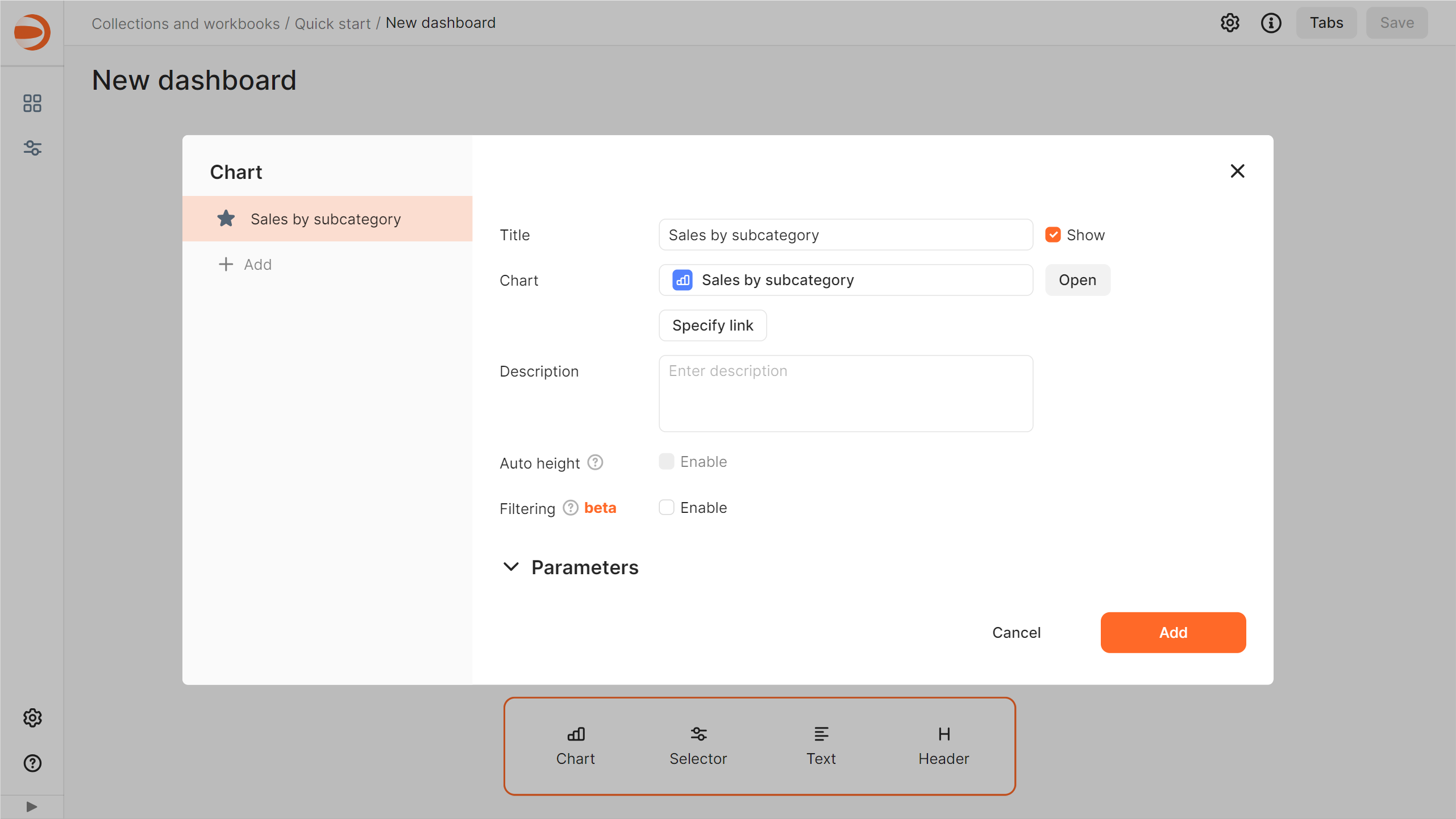
1. Click **Add**.
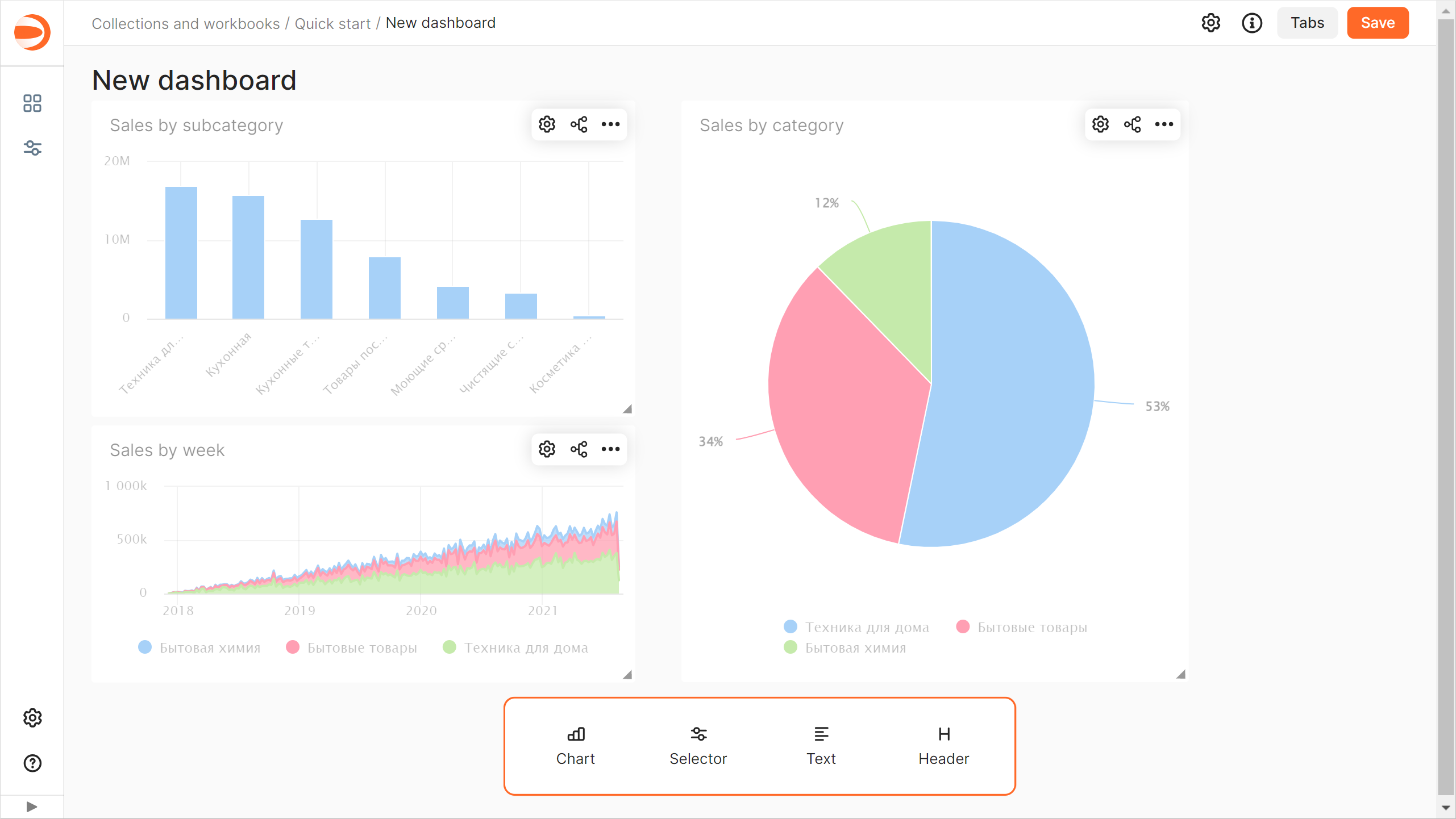
1. Repeat steps 3 through 6 to add the `Sales by week` and `Sales by subcategory` charts.
1. Adjust the size of the charts with your mouse and place them on the dashboard as you prefer.
## Set up chart filtering {#add-chart-chart-filtration}
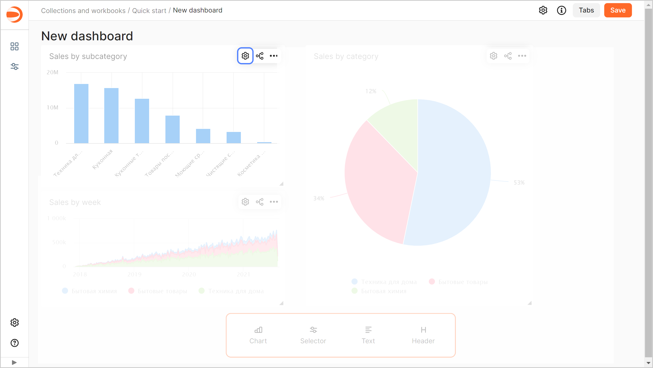
Add [filtering](./dashboard/chart-chart-filtration.md) by the `Sales by subcategory` chart to the dashboard to filter other charts:
1. Click in the top-right corner of the `Sales by subcategory` chart.
1. Enable **Filtering**.
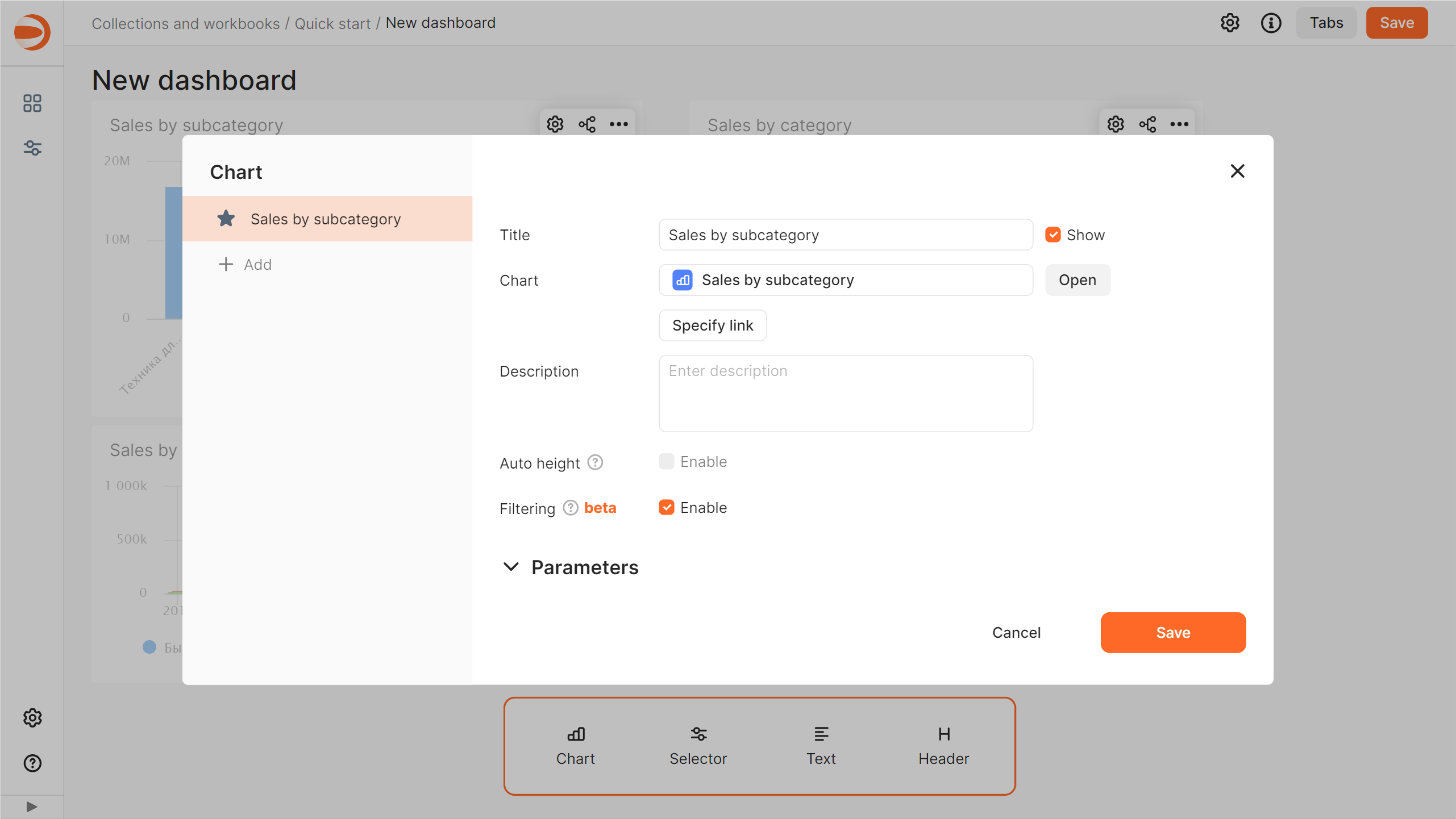
1. Click **Save**.
By default, the chart used for filtering filters data in all charts on the current dashboard tab that share the same dataset.
## Add a selector to the dashboard {#add-selectors}
[Selectors](./dashboard/selector.md) are filters that affect the results of queries in the linked widgets.
To add a selector to a dashboard:
1. In the panel at the bottom of the page, click **Selector** and drag it to a desired location.
1. Add the calendar selector for the order date:
1. Select `Sales Dataset`.
1. Select the `OrderDate` field.
1. In the **Header** field, enter `Order date`.
1. Enable **Range**.
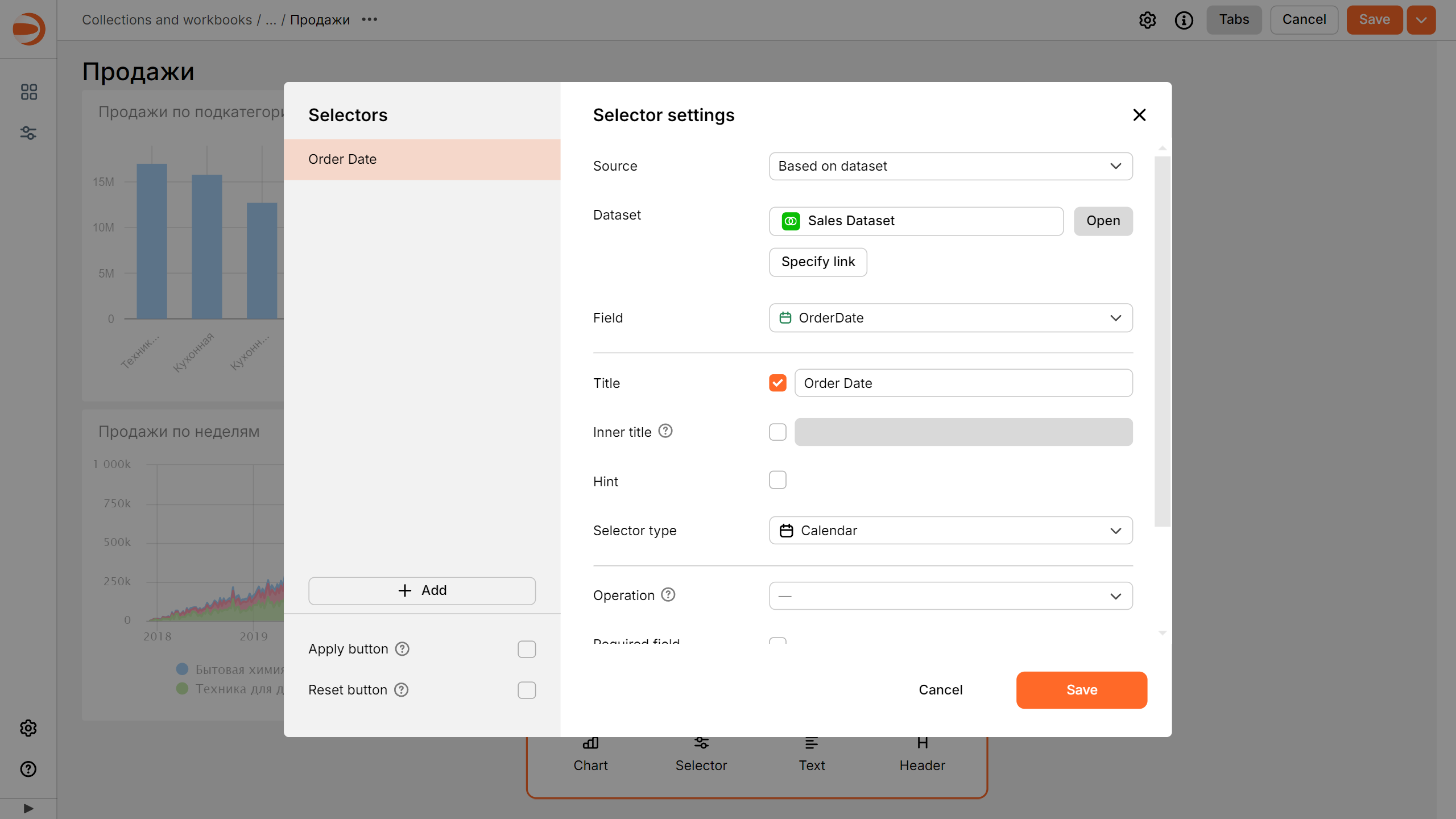
1. Click **Save**.
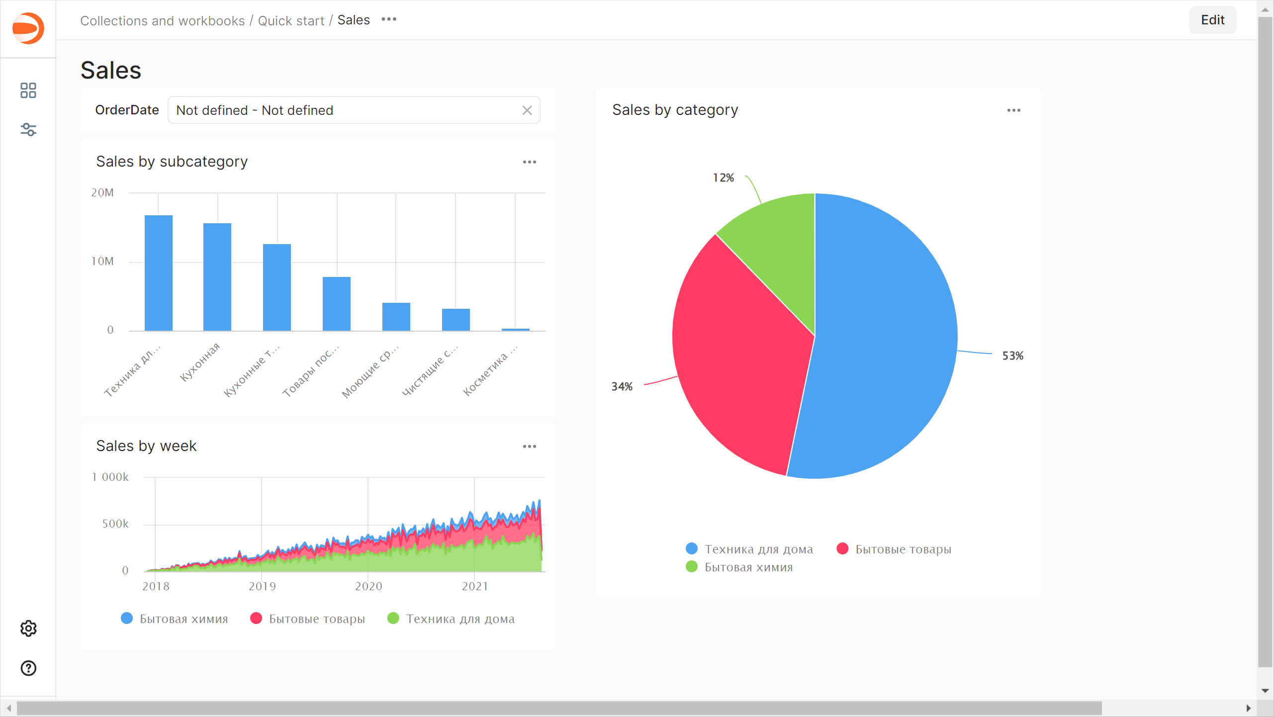
1. Position the selector on the dashboard wherever you like.
1. Save the dashboard:
1. In the top-right corner of the dashboard, click **Save**.
1. Enter `Sales` for the dashboard name and click **Create**.
## Learn how a dashboard works {#dashboard-work}
1. Apply cross-chart filtering on the dashboard:
1. In the `Sales by subcategory` chart, click the column with the `Kitchen appliances` value. This will filter the linked charts by the selected dimension.
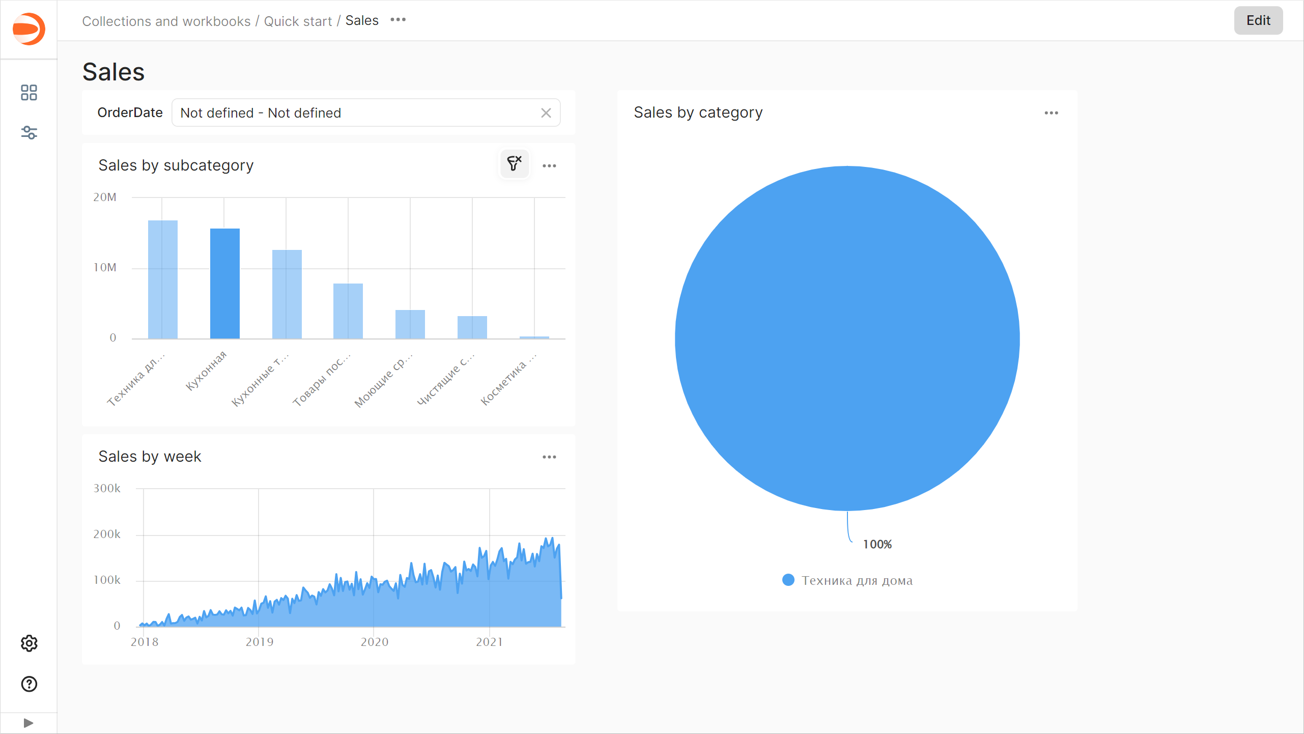
1. Clear chart filtering by clicking the selected item once more or in the top-right corner of the chart.
1. Use the `Order date` selector:
1. In the `Order date` selector, enter the period start and end dates: `01.01.2019 - 31.01.2019`.
1. This will filter data by the `OrderDate` field in all charts on the current tab that share the same dataset.
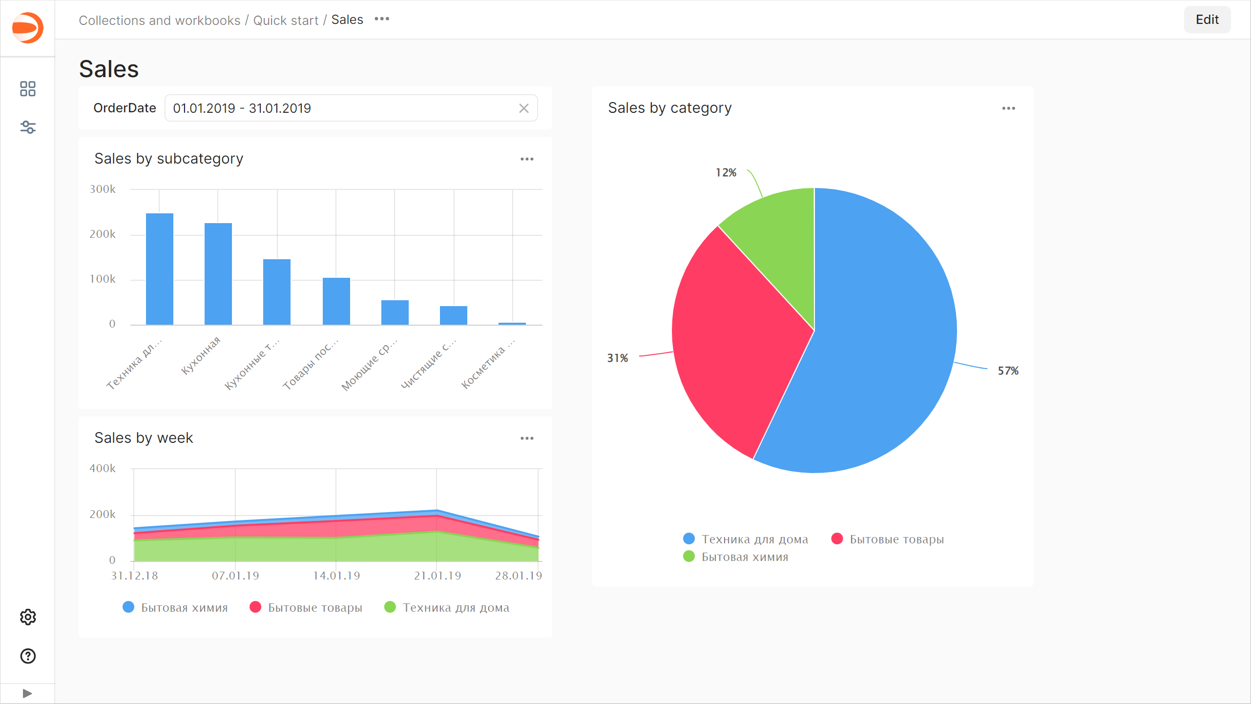
1. Clear selector filtering by clicking in the right corner of the selector.
## What's next {#whats-next}
* Read about [service concepts](./concepts/index.md).
* View an [example of a ready-to-use dashboard](https://datalens.yandex/9fms9uae7ip02).
_ClickHouse® is a registered trademark of [ClickHouse, Inc](https://clickhouse.com)._