---
metadata:
- name: generator
content: Diplodoc Platform v5.63.0
alternate:
- en/visualization-ref/pie-chart
- ru/visualization-ref/pie-chart
- href: en/visualization-ref/pie-chart.md
type: text/markdown
title: Markdown version
csp:
- script-src:
- https://mc.yandex.ru
img-src:
- https://mc.yandex.ru
connect-src:
- https://mc.yandex.ru
- wss://mc.yandex.ru
child-src:
- 'blob:'
- https://mc.yandex.ru
frame-src:
- 'blob:'
- https://mc.yandex.ru
frame-ancestors:
- 'blob:'
- https://mc.yandex.ru
canonical: en/visualization-ref/pie-chart.html
title: Pie chart in DataLens On-premises
description: >-
In this tutorial, you will learn how to create and customize the pie chart
visualization type in DataLens On-premises.
vcsPath: en/visualization-ref/pie-chart.md
---
# Pie chart in DataLens On-premises
This chart shows relative proportions of different categories to the whole as circle slices (sectors). The circle represents the total of all categories and equals 100%. The size of each segment indicates the proportion of each category to the total amount.
Pie charts are a good choice for demonstrating proportions of a small number of segments.
{% cut "Example" %}
{% list tabs %}
- Visualization

- Source table
Product categories | Sales |
-----|---------|
Home appliances | 69M |
Household goods | 57M |
Household cleaners | 44M |
{% endlist %}
{% endcut %}
{% cut "Use one color for multiple small sectors belonging to a larger category" %}

{% endcut %}
## Wizard sections {#wizard-sections}
Wizard section| Description
----- | ----
Categories | Dimension. You can specify only one field here. Your data will be grouped by this field.
Color | Dimension. You can specify only one field here. Your charts segments will be colored according to it.
Measures | Measure. You can specify only one field here.
Sorting | Measure or dimension from the **Color** section. Affects area sorting. The sorting direction is marked with an icon next to the field: for ascending or for descending. To change the sorting direction, click the icon.
Labels | Measure. Displays measure values on the chart. To add callouts with category names to the chart, drag the [Measure Names](../concepts/chart/measure-values.md) dimension to this section. [Markup functions](../function-ref/markup-functions.md) are supported. For `String` type fields, you can configure using basic [Markdown in DataLens On-premises](../dashboard/markdown.md) syntax: click the icon before the field name and enable **Markdown**.
Filters | Dimension or measure. Used as a filter.
## Creating a pie chart {#create-diagram}
To create a pie chart:
{% note warning %}
If you use the new DataLens object model with [workbooks and collections](../workbooks-collections/index.md):
1. Go to the DataLens home page.
1. Open the workbook, click **Create** in the top-right corner, and select the object you need.
Follow the guide from step 4.
{% endnote %}
1.
Go to the DataLens home page.
1.
In the left-hand panel, select **Charts**.
1.
Click **Create chart** → **Chart**.
1.
At the top left, click **Select dataset** and specify the dataset to visualize. If you do not have a dataset, [create one](../dataset/create-dataset.md#create).
1. Select **Pie chart** as the chart type.
1. Drag a dimension from the dataset to the **Categories** section.
1. Drag a dimension from the dataset to the **Color** section.
1. Drag a measure from the dataset to the **Measures** section. The values will be displayed as pie chart areas.
{% note info %}
You cannot display negative and null values on this type of chart.
{% endnote %}
## Recommendations {#recommendations}
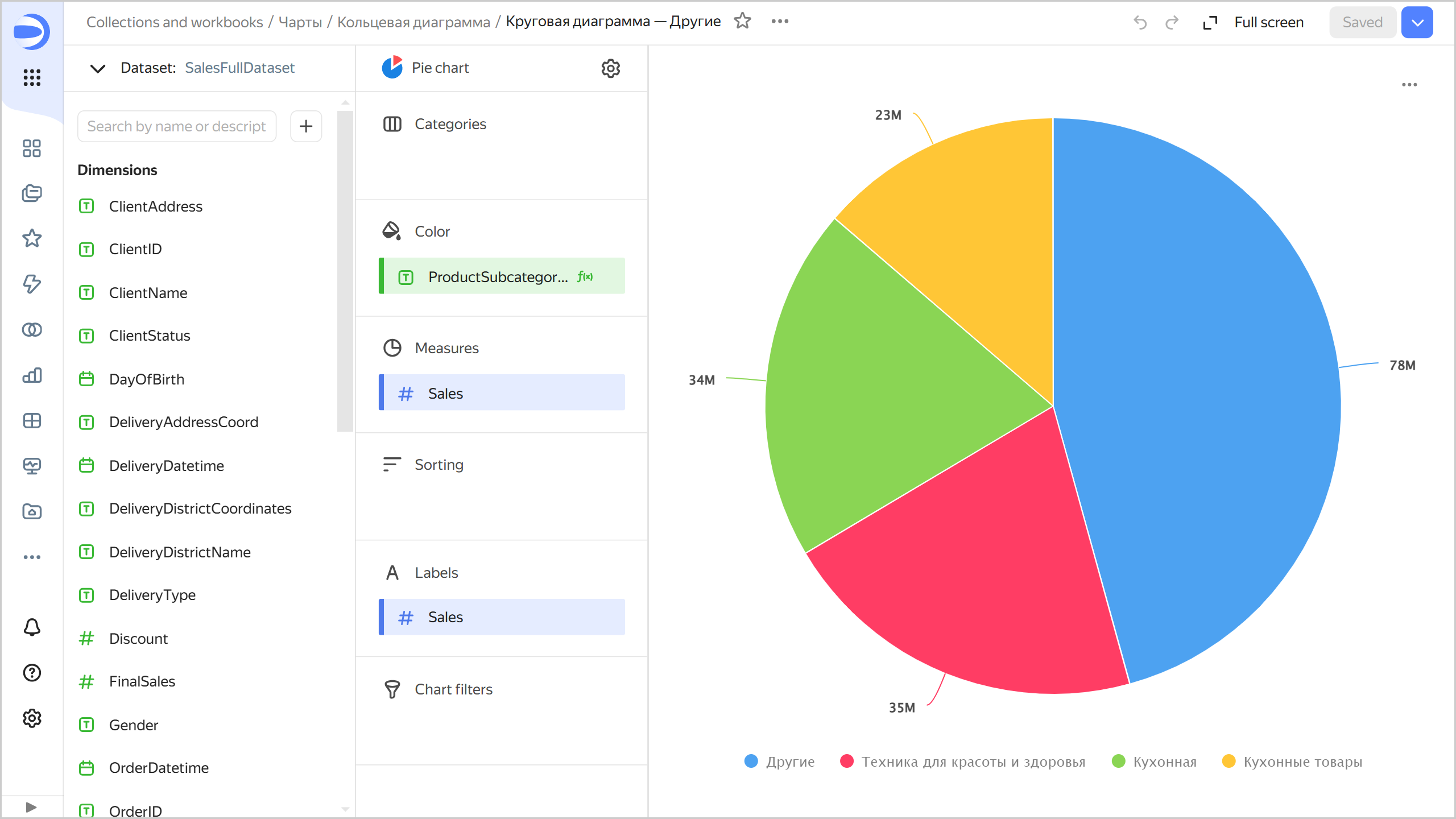
* **Segments.** With too many segments, your chart will look cluttered, making it difficult to interpret the data. If there are more than 4-6 segments in one chart, consider combining the smallest of them into one segment, e.g., `Other`. You can do this by processing the data, e.g., by creating a [calculated field](../concepts/calculations/index.md) in your dataset or chart.
{% cut "Example of combining segments in a chart" %}
**Source table**
ProductSubcategory | Sales |
-----|---------|
Beauty and health products | 11M |
Kitchenware | 34M |
Kitchen products | 23M |
Detergents | 22.5M |
Health and beauty equipment | 35M |
Non-essential goods | 23M |
Cleaners | 21.5M |
To combine multiple segments by the `ProductSubcategory` field into a joined group:
1. Add a new field to the chart with the following formula:
```
CASE [ProductSubcategory]
WHEN "Beauty and health equipment" THEN "Beauty and health equipment"
WHEN "Kitchen" THEN "Kitchen"
WHEN "Kitchenware" THEN "Kitchenware"
ELSE "Other"
END
```
1. Drag the new field to the **Color** section.
1. Drag the `Sales` field to the **Measures** and **Signatures** sections.
The sales amount will be calculated separately for the `Beauty and health equipment`, `Kitchen`, and `Kitchenware` subcategories; for other subcategories, in the `Other` group.
{% endcut %}
* **Segments.** Combine small segments into larger groups:
* Use the **Categories** section to highlight segments.
* Use the **Color** section to highlight groups.
* Do not use pie charts to show changes to proportions over time or for precisely comparing data by category.
#### Useful links {#see-also}
* [Creating a dashboard in DataLens On-premises](../operations/dashboard/create.md)
* [Adding a chart to a dashboard in DataLens On-premises](../operations/dashboard/add-chart.md)
* [Adding a selector to a dashboard in DataLens On-premises](../operations/dashboard/add-selector.md)