---
metadata:
  - name: generator
    content: Diplodoc Platform v5.63.0
alternate:
  - en/visualization-ref/scatter-chart
  - ru/visualization-ref/scatter-chart
  - href: en/visualization-ref/scatter-chart.md
    type: text/markdown
    title: Markdown version
csp:
  - script-src:
      - https://mc.yandex.ru
    img-src:
      - https://mc.yandex.ru
    connect-src:
      - https://mc.yandex.ru
      - wss://mc.yandex.ru
    child-src:
      - 'blob:'
      - https://mc.yandex.ru
    frame-src:
      - 'blob:'
      - https://mc.yandex.ru
    frame-ancestors:
      - 'blob:'
      - https://mc.yandex.ru
canonical: en/visualization-ref/scatter-chart.html
title: Scatter chart in DataLens On-premises
description: >-
  In this tutorial, you will learn how to create and customize the scatter chart
  visualization type in DataLens On-premises.
vcsPath: en/visualization-ref/scatter-chart.md
---

# Scatter chart <!-- diplodoc:svg ![](../_assets/datalens/scatter-chart.svg) --><svg xmlns="http://www.w3.org/2000/svg" width="24" height="24" fill="none" viewBox="0 0 24 24"><circle cx="7" cy="7" r="3" stroke="#1A82E3" stroke-width="2"/><circle cx="17" cy="17" r="3" stroke="#1A82E3" stroke-width="2"/><circle cx="7" cy="17" r="3" stroke="#1A82E3" stroke-width="2"/><path fill="#FF0400" fill-rule="evenodd" d="M17 4a1 1 0 0 0-1 1v1h-1a1 1 0 1 0 0 2h1v1a1 1 0 1 0 2 0V8h1a1 1 0 1 0 0-2h-1V5a1 1 0 0 0-1-1Z" clip-rule="evenodd"/></svg> in DataLens On-premises

A scatter chart shows the relationship between two values (dimensions or measures). Their values are represented as points. 

* A scatter chart always has two axes: the values of one dimension or measure are plotted along the X-axis and those of the other along the Y-axis. A data point that links these two values is displayed at the intersection of the X and Y coordinates.

  These data points can be distributed along the X-axis evenly or unevenly, depending on specific data.

* Use this type of chart if you need to find the dependency between dimensions and measures or show a range of values. For example, the relationship between the average order value and the number of orders for a product.

* You can also represent dependencies on a scatter chart using point sizes. The size of a point depends on the measure value: the higher the value, the larger the point size.

  {% cut "Example" %}

  For example, the size of a point may depend on the discount on a product.

    {% list tabs %}

    - Visualization

      ![scatter-chart](../_assets/datalens/visualization-ref/scatter-chart/scatter-chart.png =800x)

    - Source table (5 rows)

      Product | Category | Average order value | Number of orders | Discount
      ----|----|----|----|-----|
      Floor cleaner liquid|	Household cleaners|	153.0 | 1 | 0 |
      Multicooker with 40 modes|	Home appliances |	3442.0 | 1 | 0 |
      Liquid detergent for colored clothes|	Household cleaners |	525.0 | 1 | 0 |
      Carpet detergent|	Household cleaners | 463.0 | 1 | 0 |
      Lemon dishwashing liquid|	Household cleaners| 362.0 | 1 | 0 |


    {% endlist %}

    {% endcut %}


* You can use a gradient in a chart by adding a measure to the **Color** section. For example, the higher the product's average check, the darker the point.

  {% cut "Example" %}
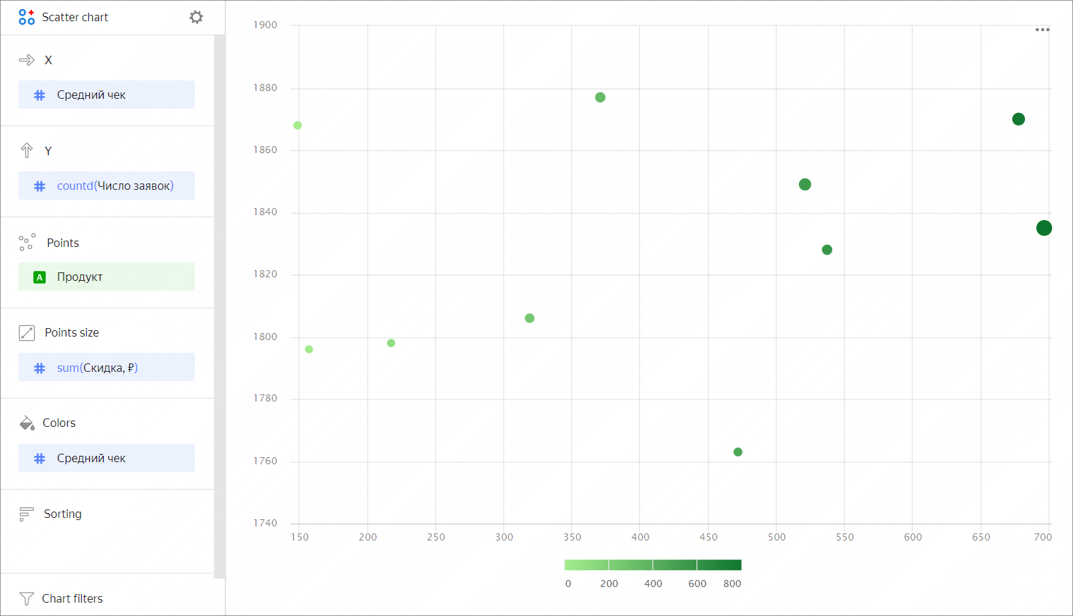
  ![scatter-chart](../_assets/datalens/visualization-ref/scatter-chart/gradient-scatter-chart.png)

  {% endcut %}

## Wizard sections {#wizard-sections}

Wizard<br/> section| Description
----- | ----
X | Dimension or measure. Sets the X-axis value. For `String` type fields, you can configure using basic [Markdown in DataLens On-premises](../dashboard/markdown.md) syntax: click the icon before the field name and enable **Markdown**.
Y | Dimension or measure. Sets the Y-axis value. For `String` type fields, you can configure using basic [Markdown in DataLens On-premises](../dashboard/markdown.md) syntax: click the icon before the field name and enable **Markdown**.
Points | Dimension. Specifies the number of points on the chart.
Point size | Measure. Sets point size depending on the measure value.
Colors | Dimension or measure. Affects the color of points.
Sorting | Dimension. You can only use a dimension from the X axis. Affects the sorting of the X axis. The sorting direction is marked with an icon next to the field: <!-- diplodoc:svg ![image](../_assets/console-icons/bars-ascending-align-left.svg) --><svg xmlns="http://www.w3.org/2000/svg" width="16" height="16" fill="none" viewBox="0 0 16 16"><path fill="currentColor" fill-rule="evenodd" d="M1 12.75c0 .414.336.75.75.75h12.5a.75.75 0 0 0 0-1.5H1.75a.75.75 0 0 0-.75.75M1 8c0 .414.336.75.75.75h8.5a.75.75 0 0 0 0-1.5h-8.5A.75.75 0 0 0 1 8m.75-4a.75.75 0 0 1 0-1.5h2.5a.75.75 0 0 1 0 1.5z" clip-rule="evenodd"/></svg> for ascending or <!-- diplodoc:svg ![image](../_assets/console-icons/bars-descending-align-left.svg) --><svg xmlns="http://www.w3.org/2000/svg" width="16" height="16" fill="none" viewBox="0 0 16 16"><path fill="currentColor" fill-rule="evenodd" d="M1 3.25a.75.75 0 0 1 .75-.75h12.5a.75.75 0 0 1 0 1.5H1.75A.75.75 0 0 1 1 3.25M1 8a.75.75 0 0 1 .75-.75h8.5a.75.75 0 0 1 0 1.5h-8.5A.75.75 0 0 1 1 8m.75 4a.75.75 0 0 0 0 1.5h2.5a.75.75 0 0 0 0-1.5z" clip-rule="evenodd"/></svg> for descending. To change the sorting direction, click the icon.
Filters | Dimension or measure. Used as a filter.

## Creating a scatter chart {#create-diagram}

To create a scatter chart:


<!-- source: en/_includes/datalens/operations/datalens-workbooks-collections-note-step4.md -->
{% note warning %}

If you use the new DataLens object model with [workbooks and collections](../workbooks-collections/index.md):


1. Go to the DataLens home page.


1. Open the workbook, click **Create** in the top-right corner, and select the object you need.

Follow the guide from step 4.

{% endnote %}
<!-- endsource: en/_includes/datalens/operations/datalens-workbooks-collections-note-step4.md -->


1. <!-- source: en/_includes/datalens/visualization-ref/create-1.md -->
   Go to the DataLens home page.
   <!-- endsource: en/_includes/datalens/visualization-ref/create-1.md -->
1. <!-- source: en/_includes/datalens/visualization-ref/create-2.md -->
   In the left-hand panel, select <!-- diplodoc:svg ![chart](../_assets/console-icons/chart-column.svg) --><svg xmlns="http://www.w3.org/2000/svg" width="16" height="16" fill="none" viewBox="0 0 16 16"><g clip-path="url(#svg-37jd9dcr__a)"><path fill="currentColor" fill-rule="evenodd" d="M11.5 3.5h2a.5.5 0 0 1 .5.5v8a.5.5 0 0 1-.5.5h-2a.5.5 0 0 1-.5-.5V4a.5.5 0 0 1 .5-.5m-2.5 9a.5.5 0 0 0 .5-.5V7a.5.5 0 0 0-.5-.5H7a.5.5 0 0 0-.5.5v5a.5.5 0 0 0 .5.5zm-4.5 0A.5.5 0 0 0 5 12v-2a.5.5 0 0 0-.5-.5h-2a.5.5 0 0 0-.5.5v2a.5.5 0 0 0 .5.5zm-1 1.5h-1a2 2 0 0 1-2-2v-2a2 2 0 0 1 2-2h2q.26 0 .5.063V7a2 2 0 0 1 2-2h2q.26 0 .5.063V4a2 2 0 0 1 2-2h2a2 2 0 0 1 2 2v8a2 2 0 0 1-2 2z" clip-rule="evenodd"/></g><defs><clipPath id="svg-37jd9dcr__a"><path fill="currentColor" d="M0 0h16v16H0z"/></clipPath></defs></svg> **Charts**.
   <!-- endsource: en/_includes/datalens/visualization-ref/create-2.md -->
1. <!-- source: en/_includes/datalens/visualization-ref/create-3.md -->
   Click **Create chart** → **Chart**.
   <!-- endsource: en/_includes/datalens/visualization-ref/create-3.md -->
1. <!-- source: en/_includes/datalens/visualization-ref/create-4.md -->
   At the top left, click <!-- diplodoc:svg ![image](../_assets/console-icons/circles-intersection.svg) --><svg xmlns="http://www.w3.org/2000/svg" width="16" height="16" fill="none" viewBox="0 0 16 16"><path fill="currentColor" fill-rule="evenodd" d="M6.576 11.854a4 4 0 1 1 0-7.707A5.48 5.48 0 0 0 5 8c0 1.5.601 2.861 1.576 3.854M8 12.9a5.5 5.5 0 1 1 0-9.8 5.5 5.5 0 1 1 0 9.8m1.424-8.754A4.003 4.003 0 0 1 14.5 8a4 4 0 0 1-5.076 3.854A5.48 5.48 0 0 0 11 8c0-1.5-.601-2.861-1.576-3.854M8 4.877C8.914 5.61 9.5 6.737 9.5 8s-.586 2.39-1.5 3.123A4 4 0 0 1 6.5 8c0-1.263.586-2.39 1.5-3.123" clip-rule="evenodd"/></svg> **Select dataset** and specify the dataset to visualize. If you do not have a dataset, [create one](../dataset/create-dataset.md#create).
   <!-- endsource: en/_includes/datalens/visualization-ref/create-4.md -->
1. Select **Scatter chart** as the chart type.
1. Drag a dimension from the dataset to the **X** section.
1. Drag one or more measures from the dataset to the **Y** section. The values will be displayed as points at the intersection of the X and Y axes.

### Additional options

Also, you can:

* Change the color of points:

  1. Drag a dimension or measure to the **Colors** section.
  1. Click <!-- diplodoc:svg ![](../_assets/console-icons/gear.svg) --><svg xmlns="http://www.w3.org/2000/svg" width="16" height="16" fill="none" viewBox="0 0 16 16"><path fill="currentColor" fill-rule="evenodd" d="M7.199 2H8.8a.2.2 0 0 1 .2.2c0 1.808 1.958 2.939 3.524 2.034a.2.2 0 0 1 .271.073l.802 1.388a.2.2 0 0 1-.073.272c-1.566.904-1.566 3.164 0 4.069a.2.2 0 0 1 .073.271l-.802 1.388a.2.2 0 0 1-.271.073C10.958 10.863 9 11.993 9 13.8a.2.2 0 0 1-.199.2H7.2a.2.2 0 0 1-.2-.2c0-1.808-1.958-2.938-3.524-2.034a.2.2 0 0 1-.272-.073l-.8-1.388a.2.2 0 0 1 .072-.271c1.566-.905 1.566-3.165 0-4.07a.2.2 0 0 1-.073-.27l.801-1.389a.2.2 0 0 1 .272-.072C5.042 5.138 7 4.007 7 2.199c0-.11.089-.199.199-.199M5.5 2.2c0-.94.76-1.7 1.699-1.7H8.8c.94 0 1.7.76 1.7 1.7a.85.85 0 0 0 1.274.735 1.7 1.7 0 0 1 2.32.622l.802 1.388c.469.813.19 1.851-.622 2.32a.85.85 0 0 0 0 1.472 1.7 1.7 0 0 1 .622 2.32l-.802 1.388a1.7 1.7 0 0 1-2.32.622.85.85 0 0 0-1.274.735c0 .939-.76 1.7-1.699 1.7H7.2a1.7 1.7 0 0 1-1.699-1.7.85.85 0 0 0-1.274-.735 1.7 1.7 0 0 1-2.32-.622l-.802-1.388a1.7 1.7 0 0 1 .622-2.32.85.85 0 0 0 0-1.471 1.7 1.7 0 0 1-.622-2.32l.801-1.389a1.7 1.7 0 0 1 2.32-.622A.85.85 0 0 0 5.5 2.2m4 5.8a1.5 1.5 0 1 1-3 0 1.5 1.5 0 0 1 3 0M11 8a3 3 0 1 1-6 0 3 3 0 0 1 6 0" clip-rule="evenodd"/></svg> and set new colors.

* Resize points:

  1. Drag the measure to the **Point size** section.
  1. Click <!-- diplodoc:svg ![](../_assets/console-icons/gear.svg) --><svg xmlns="http://www.w3.org/2000/svg" width="16" height="16" fill="none" viewBox="0 0 16 16"><path fill="currentColor" fill-rule="evenodd" d="M7.199 2H8.8a.2.2 0 0 1 .2.2c0 1.808 1.958 2.939 3.524 2.034a.2.2 0 0 1 .271.073l.802 1.388a.2.2 0 0 1-.073.272c-1.566.904-1.566 3.164 0 4.069a.2.2 0 0 1 .073.271l-.802 1.388a.2.2 0 0 1-.271.073C10.958 10.863 9 11.993 9 13.8a.2.2 0 0 1-.199.2H7.2a.2.2 0 0 1-.2-.2c0-1.808-1.958-2.938-3.524-2.034a.2.2 0 0 1-.272-.073l-.8-1.388a.2.2 0 0 1 .072-.271c1.566-.905 1.566-3.165 0-4.07a.2.2 0 0 1-.073-.27l.801-1.389a.2.2 0 0 1 .272-.072C5.042 5.138 7 4.007 7 2.199c0-.11.089-.199.199-.199M5.5 2.2c0-.94.76-1.7 1.699-1.7H8.8c.94 0 1.7.76 1.7 1.7a.85.85 0 0 0 1.274.735 1.7 1.7 0 0 1 2.32.622l.802 1.388c.469.813.19 1.851-.622 2.32a.85.85 0 0 0 0 1.472 1.7 1.7 0 0 1 .622 2.32l-.802 1.388a1.7 1.7 0 0 1-2.32.622.85.85 0 0 0-1.274.735c0 .939-.76 1.7-1.699 1.7H7.2a1.7 1.7 0 0 1-1.699-1.7.85.85 0 0 0-1.274-.735 1.7 1.7 0 0 1-2.32-.622l-.802-1.388a1.7 1.7 0 0 1 .622-2.32.85.85 0 0 0 0-1.471 1.7 1.7 0 0 1-.622-2.32l.801-1.389a1.7 1.7 0 0 1 2.32-.622A.85.85 0 0 0 5.5 2.2m4 5.8a1.5 1.5 0 1 1-3 0 1.5 1.5 0 0 1 3 0M11 8a3 3 0 1 1-6 0 3 3 0 0 1 6 0" clip-rule="evenodd"/></svg> and set the minimum and maximum point sizes for the specified measure.

  {% note info %}

  A scatter chart isn't suitable for visualization of data over time.

  {% endnote %}

* Specify an additional dimension. To do this, drag a dimension to the **Points** section.

### Configuring display of null values {#null-settings}

<!-- source: en/_includes/datalens/datalens-chart-null-settings.md -->
* If the source data has a row with `null` for a measure value, this point will not be plotted on a chart with default settings.

    _For example, if the source has a row with the date, `20.07.2022`, but the sales total for it is not specified._

    To set up null value display on a chart:

    1. Click <!-- diplodoc:svg ![image](../_assets/console-icons/gear.svg) --><svg xmlns="http://www.w3.org/2000/svg" width="16" height="16" fill="none" viewBox="0 0 16 16"><path fill="currentColor" fill-rule="evenodd" d="M7.199 2H8.8a.2.2 0 0 1 .2.2c0 1.808 1.958 2.939 3.524 2.034a.2.2 0 0 1 .271.073l.802 1.388a.2.2 0 0 1-.073.272c-1.566.904-1.566 3.164 0 4.069a.2.2 0 0 1 .073.271l-.802 1.388a.2.2 0 0 1-.271.073C10.958 10.863 9 11.993 9 13.8a.2.2 0 0 1-.199.2H7.2a.2.2 0 0 1-.2-.2c0-1.808-1.958-2.938-3.524-2.034a.2.2 0 0 1-.272-.073l-.8-1.388a.2.2 0 0 1 .072-.271c1.566-.905 1.566-3.165 0-4.07a.2.2 0 0 1-.073-.27l.801-1.389a.2.2 0 0 1 .272-.072C5.042 5.138 7 4.007 7 2.199c0-.11.089-.199.199-.199M5.5 2.2c0-.94.76-1.7 1.699-1.7H8.8c.94 0 1.7.76 1.7 1.7a.85.85 0 0 0 1.274.735 1.7 1.7 0 0 1 2.32.622l.802 1.388c.469.813.19 1.851-.622 2.32a.85.85 0 0 0 0 1.472 1.7 1.7 0 0 1 .622 2.32l-.802 1.388a1.7 1.7 0 0 1-2.32.622.85.85 0 0 0-1.274.735c0 .939-.76 1.7-1.699 1.7H7.2a1.7 1.7 0 0 1-1.699-1.7.85.85 0 0 0-1.274-.735 1.7 1.7 0 0 1-2.32-.622l-.802-1.388a1.7 1.7 0 0 1 .622-2.32.85.85 0 0 0 0-1.471 1.7 1.7 0 0 1-.622-2.32l.801-1.389a1.7 1.7 0 0 1 2.32-.622A.85.85 0 0 0 5.5 2.2m4 5.8a1.5 1.5 0 1 1-3 0 1.5 1.5 0 0 1 3 0M11 8a3 3 0 1 1-6 0 3 3 0 0 1 6 0" clip-rule="evenodd"/></svg> in the top-right corner of the section with the measure you want to configure (the icon appears when you hover over the section).
    1. In **Empty values (null)**, select `Display as 0`.
    1. Click **Apply**. Now the chart will use `0` instead of `null`.

* If a row is missing from the source data altogether, the chart section settings will not change the chart. 

    _For example, if the source does not have a row with the particular date, `20.07.2022`, nothing will be shown for this date on the chart._

For more information, see [Configuring the display of null values in a DataLens On-premises chart](../operations/chart/chart-null-settings.md).
<!-- endsource: en/_includes/datalens/datalens-chart-null-settings.md -->

## Recommendations {#recomendations}

* <!-- source: en/_includes/datalens/datalens-category-text.md -->
  **Labels.** If the category values are too verbose, make them shorter so that the chart labels look neater.

  You can use string functions in calculated fields or the [CASE](../function-ref/CASE.md) conditional statements.
  <!-- endsource: en/_includes/datalens/datalens-category-text.md -->
* The axis scale often varies and may start with a value other than 0. Pay attention to value signatures.
* **Colors**. When visualizing multiple measures, select colors carefully. They should be distinguishable and contrasting.

<!-- source: en/_includes/datalens/visualization-ref/see-also-sub.md -->
#### Useful links {#see-also}

* [Creating a dashboard in DataLens On-premises](../operations/dashboard/create.md)
* [Adding a chart to a dashboard in DataLens On-premises](../operations/dashboard/add-chart.md)
* [Adding a selector to a dashboard in DataLens On-premises](../operations/dashboard/add-selector.md)
<!-- endsource: en/_includes/datalens/visualization-ref/see-also-sub.md -->